

The Year of Plague and Politics
As we close out a year that few will likely ever forget, we are reassured to see some major risks fade into the rearview mirror and some hopeful developments coming ever closer into reach.
We outlined in our July commentary the case for why, for the first time in nearly 14 months, we had increased the risk-asset exposure across all our models back in May of this year. Numerous market and economic indicators we tracked pointed to a constructive environment for such a shift in our asset allocations, yet we indicated we wanted to hold back some dry powder to buy on weakness in the advent that there proved to be increased volatility around the U.S. Presidential Election.
With the November election largely decided, with some latent risk associated with the two Georgia Senate run-offs, we are comfortable in embracing a cruising speed allocation across all our models, the first time we have done so since essentially the beginning of 2019. With the likely prospect of a divided government south of the border, we feel that the risk of excessive policy swings which could adversely affect markets is markedly lower than had been feared.
In looking at the odd divergences seen this year in markets behavior versus that of our economies, it brings us to a concept of staggered cycles we have often tried to frame for clients. This idea outlines how the cycles of asset markets, corporate earnings, credit conditions and that of various economies can often be found revolving in staggered fashion, taking cues from each other in manners that can, at times, seem incoherent or divergent. We have often found that these cross-signals can be especially evident around economic inflections points, say around expansions tipping into recession and vice-versa. Case in point was this year where we had many clients ask incredulously how the market kept marching higher in the face of some of the worst economic conditions in modern history.
The specific point we would reiterate is that our team has usually put more focus on credit conditions than other factors to get a read on risk-appetite and the posture we should employ for our models’ allocations. So in highlighting the occasional stark contrasts seen in asset markets’ behavior against the health of various economies, we point to indicators and relationships such as Equity Risk Premia, TINA (There is No Alternative) in asset allocations decisions of market participants, credits spreads and yield curve shapes, and of course central bank liquidity injections as some of the bigger items to watch in gauging market expectations. To get a current bead on where we stand, let us look at a few of these now.
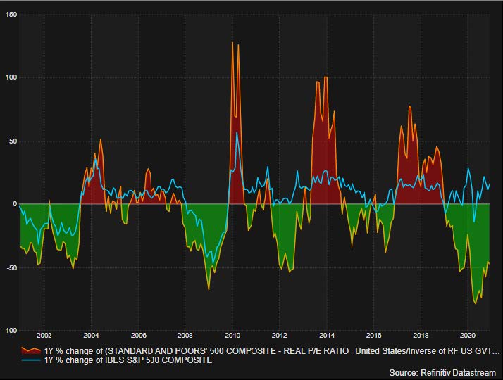
The following chart reveals an oscillator contrasting the relative attractiveness of S&P500’s (our general equity proxy) valuation against the US 10-year yield (our general risk-free rate proxy) and then superimposing upon it the concurrent annualized return of the same S&P500. Our read of it is that generally when the oscillator in the relationship has been green, implying the valuation of the S&P500 is attractive relative to the US 10-year yield, there has been subsequently improved S&P500 returns and vice-versa. This is way of looking at the aforementioned concept of TINA and from the chart, it can be observed that we are currently in a favorable green zone of relative value for the S&P500 and that we could expect, based on the history painted by this chart, relatively favorable returns going forward. Looking at the S&P500 being relatively good value might seem dissonant when hearing about the markets’ being currently at or near all-time-highs, but one must remember that the relative attractiveness of any asset should be viewed in context of its peers, so this chart is likewise implying that government bonds may be even more expensive than equities.
Another relationship we have been highlighting to clients for more than the past decade is one where there appears to be some correlation between central bank balance sheet growth and concurrent and/or lagged strength in equity markets. The following chart reveals this relationship between the Federal Reserve’s balance sheet and the S&P500 over the past year. Just looking at the sharp increase in the Fed’s balance sheet since the March crisis and the concurrent strength in the S&P500 over that same period, one could posit from looking at this chart that the market’s plunge was quite possibly arrested by the arrival of this dramatic increase in central bank liquidity and has continued to fuel its rise.
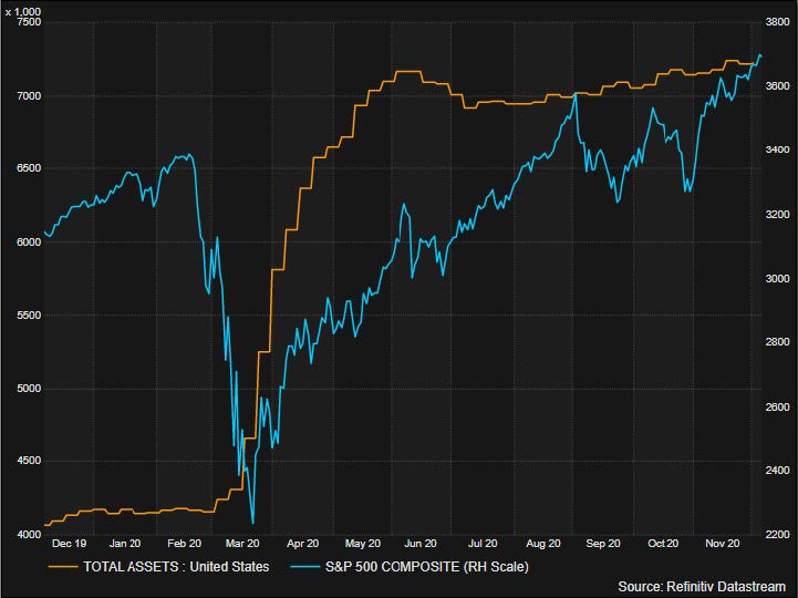
More importantly for our outlook, this policy of balance sheet expansion has been telegraphed to be on course to continue for the medium term, which we consider to be a major pillar of our bullish thesis over that time frame. As we will mention later surrounding the possible economic impact from the broad vaccinations of our populations, should the pace of economic recovery warrant that central banks begin to send signals that they intend to adjust these policies, we would take that guidance as a significant guidepost to adjust our outlook and allocations.
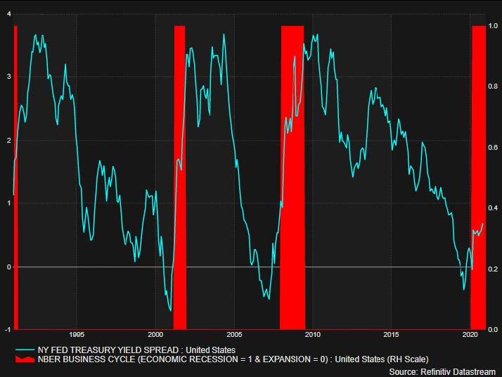
Another chart we would cite is one that we shared often last year when warning of impending economic concerns for this year (again concerns around a cyclical downturn, not pandemic related) and had us tact defensively across all our models. Much like it can be said that the inversion of the yield curve has historically proven to be a pretty reliable indicator of upcoming economic contraction, so too can the sharp steepening of that same curve reflect improved economic conditions going forward. We are seeing the current steepening of this curve on the chart as analog to the experiences in 2002 and 2009, so we consider this another bullish signal for our allocations.
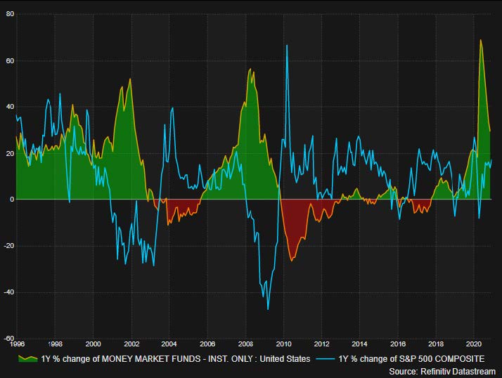
The final chart at the end of the of our July commentary outlined the amount of money market funds held outstanding, showing the dramatic increase since March in these funds when fears surrounding the pandemic had market participants rush to safe havens. Our take was that this sizable hoard of money market cash would be the fuel to send risk-assets higher as they were redeployed back. The following chart reimagines this relationship of flows into and out of money market funds with the S&P500’s returns superimposed, both annualized. Our read of this oscillator shows that when money market flows have been positive and have peaked (green shaded area), the ensuing reversal of those flows has coincided with significant subsequent increases in the S&P500’s performance (2003 and 2009 in particular). So in looking at the chart, it would seem that we are, likewise, in a similar situation of rapidly reversing money market flows but with still plenty of room for them to reach a cyclical trough, so we also consider this a bullish factor for the medium term.
Finally, it has seemed like the equity markets have been churning sideways from September until just recently. However, once can observe that underneath that price action of the major indices has been interesting rotations in the stocks of different sectors and industries. With the promising announcements of vaccine approvals and rollouts, certain growth sectors (Technology, Communications Services, e-commerce) that had seemed impervious or even benefited from the economic conditions during the pandemic seemed to have taken a pause and more cyclical names (Financials, Real-Estate, Industrials, Discretionary) took over short-term leadership as the prospects of a broad economic recovery from the pandemic seemed to come closer into view.
We have highlighted this “back-and-fill” dynamic of broader participation of stocks and sectors in the advance of the overall indices as very healthy and welcome to sustain the bull market. That said, given the enormous concentration in the markets of a select handful of trillion-dollar market-cap stocks, any weakness in those names could hold back the nominal price of the larger indices for a time. That is why it is important to look at measures of internal breadth of the market such as cumulative advance-decline lines, McLennan volume summations, and measures of the percentage of stocks above their 50-day and 200-day moving averages, to name a few. These measures look indeed healthy to our eyes among the larger indices.
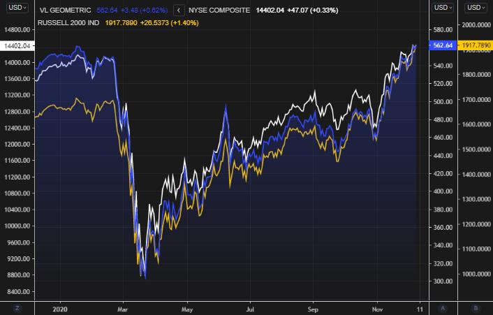
Moreover, we have cited previously other indices such as the Value Line Geometric Index, NYSE Composite Index, and Russell 2000 Index as alternative measures of broader market participation to watch closely for confirmation of the advance of the larger indices. From the chart below, these four also look quite healthy.
SOURCE: REFINITIV WORKSPACE
What’s Next?
The same constructive market indicators we saw in May remain largely extant and our focus has now shifted more on to developments in the rollout of the various approved or soon-to-be approved vaccines in the developed world, namely those of Pfizer/BioNTech, Moderna, and Oxford/AstraZeneca, and how this will affect various health authorities’ orders and the reopening of our societies.
Many clients are familiar with the old Wall St. adage “Buy the rumour, sell the news.” In our discussion with many of you, we have drawn a parallel to the concept behind that expression and how we see markets play out over the next 6 months. In that vein, we suspect that we shall see a “Buy the pandemic, sell the vaccine/reopening” setup for markets. The bull run since March have been essentially pricing-in eventual recovery, backstopped by vast fiscal and monetary largess from authorities, but will face a “what’s next?” situation once a sufficient percentage of the population has been vaccinated to allow a material reopening of our societies and large swaths of our service economies.
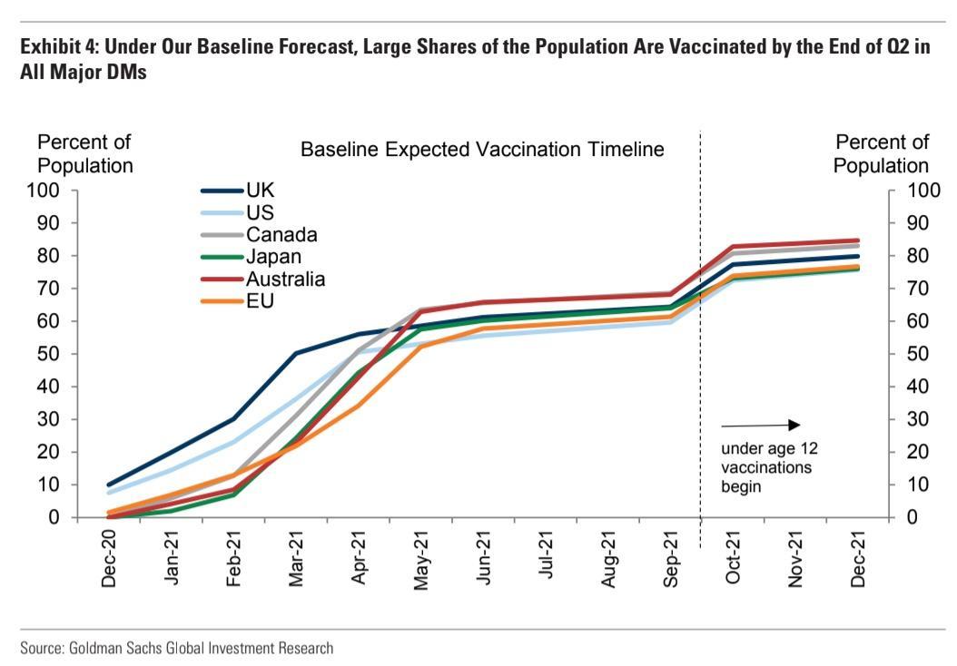
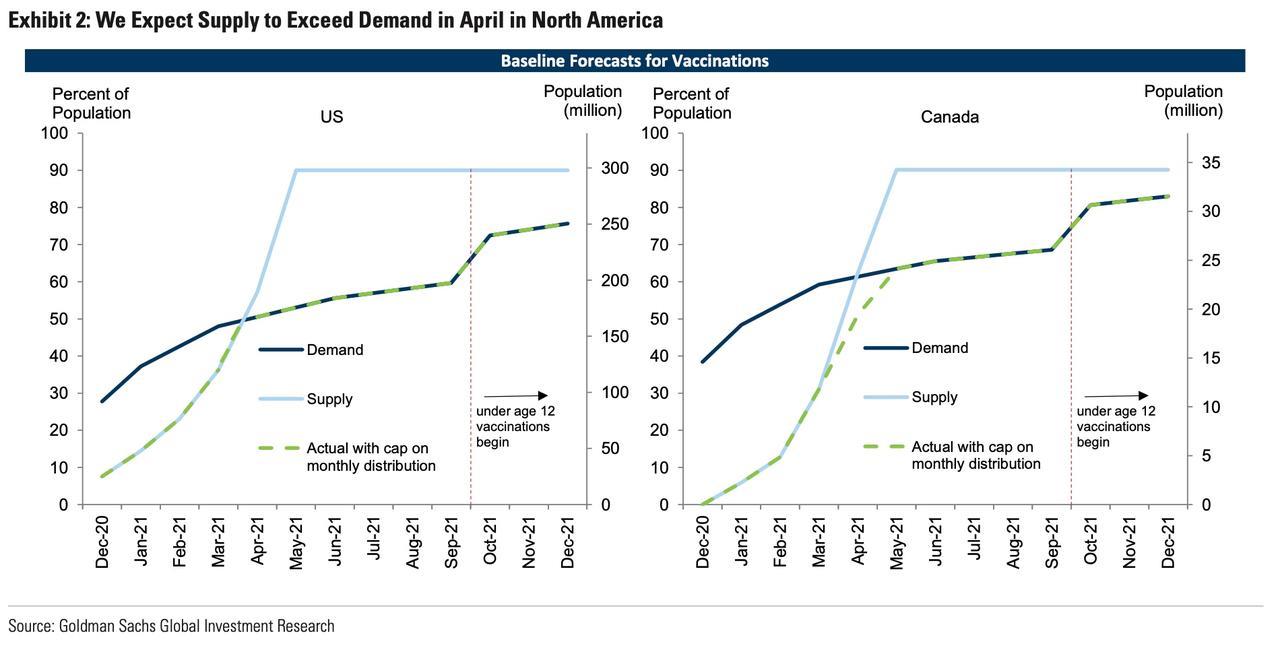
Upon this reopening, we would expect unemployment would still remain elevated and output gaps would persist in many sectors of the economy, but our concern is that the market would shift focus decidedly upon whether central banks would remain accommodative or shift to a more neutral (or even tightening?) posture with economic conditions improving. This is not necessarily a recipe for a bull-blown bear market, but with the vaccinations proceeding in earnest in the first half of next year (see below two charts from Goldman Sachs outlining their house view of the pace amongst 6 large developed economies), we could easily see a sizeable correction in markets come late Spring or early Summer, as health authorities loosen restrictions in the face of increased herd immunity amongst their populations. We would want to tactically position around this “sell the news” event.
Precious, Indeed
Our last major point we will touch upon is our view surrounding precious metals, and namely gold. The shiny metal has recently unwound some of its massive gains it has realized since 2018 in a consolidation pattern on the back of vaccine optimism, however we see its bull market as very much intact. Notwithstanding losing some safe haven flows off expectations of the global economy emerging from the pandemic, in our view the fundamental drivers of massive deficit spending by governments, significant balance sheet expansion by central banks, and medium term depreciation of the USD, remain strong.
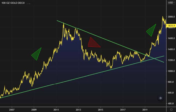
As seen in the chart below, gold has moved in long, sweeping bull and bear markets over the years, so our view is that the relatively recent breakout two years ago is only early innings in the current bull market and that our expectation for the performance of precious metals is measured in years, not months.
SOURCE: REFINITIV WORKSPACE
Furthermore, as you can see from the following chart, it is our view that a more specific driver of gold’s advance over the past few years has been real rates plummeting. You can see the incredibly strong correlation between TIPS (Treasury Inflation Protected Notes, which are one of the best barometers of real rates and move in the inverse of real rates) in blue and gold in yellow.
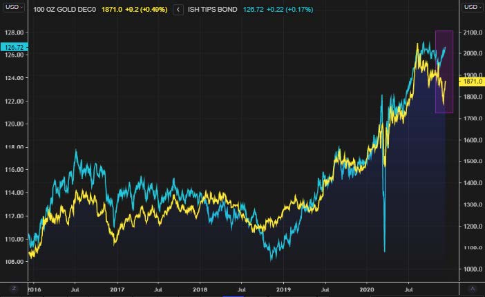
SOURCE: REFINITIV WORKSPACE
Moreover, speaking to the more recent weakness in gold’s price, notice how in September, TIPS began to weaken, which then gold followed. Then in November, TIPS begun to resume their uptrend and yet gold dropped another leg down (area shaded in purple). We would not be surprised to see that once this corrective action in gold is done, it could rapidly catch back up to where TIPS is trading and resume its uptrend.
Housekeeping
Starting in the New Year, our team will be launching a new effort to move our client and community communications largely online where we feel much of the conversation has now migrated. In the interest of providing more frequent, timely and digestible commentary and missives, we will be moving to posting on the newswire page of our website www.shiptonduric.com and simultaneously pushing these posts to various social media platforms. We will provide further information on this new campaign in an upcoming notice, so stay tuned.
Thank You
The year of COVID-19 has had an impact on us all, but one silver lining to a very dark cloud has been the fact that it has compelled many of us to take stock of the important things in life. In that sentiment, we want to thank our staff and clients for their support through this difficult year. We are confident better days are ahead and we look forward to reaching them together with you all.
Merry Christmas and Happy New Year
Omar Duric
Senior Portfolio Manager
Shipton Duric & Associates