Maili’s Market Insights Video: Investing amidst Market Volatility and New Market Highs
Click above to watch the 13 minute video.
Many of our clients value us as a stabilizing force during turbulent times, and so I thought I would share some key insights, based on common questions asked, about how to invest amidst market volatility, or how to successfully invest when the markets are making new highs.
The COVID 19 pandemic that rocked the globe led to some major declines across all major asset classes in the Spring of last year, and now, just 9 months later, many of these markets are trading near all-time highs. It’s enough to give most investors a headspin! But what I hope to illuminate today, is why while market volatility can “feel” uncomfortable to the average investor, it’s very normal, and an expected part of investing. I’ll show how we can take advantage of this volatility, on behalf of our clients to seize the opportunities.
Watch the 13 minute video above for Maili’s insights or read the full article and look through the slides below.
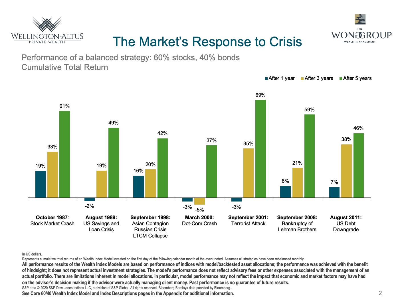
Slide 2: The Market’s Response to Volatility
This slide shows performance of a balanced investment strategy following a series of major crises that have taken place over history – From the October 1987 Crash, to the March 2000 Internet Bubble Dot Com Crash, to the September 2001 Terrorist Attacks in 2001, and even the 2008 Global Financial Crisis. Each of these periods saw huge equity market declines like what we saw last year with the COVID19 global pandemic market decline.
Although a global investment strategy would have suffered losses immediately following most of these events, the financial markets recovered over time, as indicated by the positive five-year cumulative returns. As you can see in this chart, the subsequent 1 year returns (in blue), 3 year returns (in yellow) and 5 year returns (in green) show that even in major crises, markets are likely to recover within a few years time.
Negative events such as these may tempt investors to flee the financial markets. But diversification and a long-term perspective can help investors apply discipline to ride out the storm.
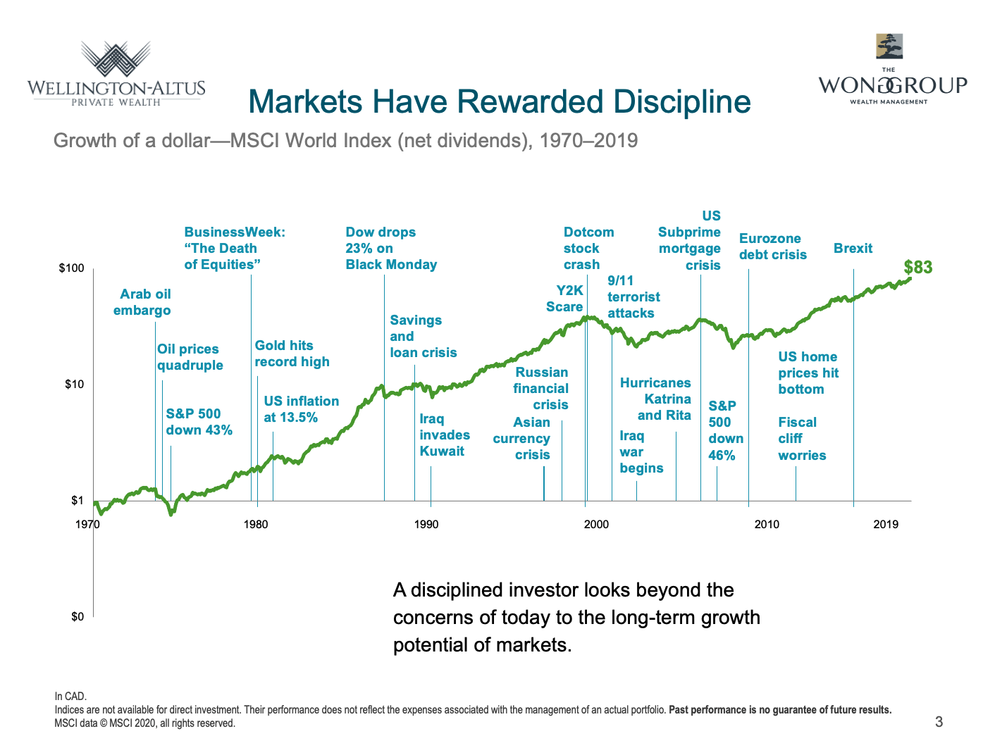
Slide 3: Markets Have Rewarded Discipline
What we also know, is that despite a lot of scary world events and dramatic crises, investing in global equities have rewarded investors who have stayed disciplined.
This chart shows the growth of $1 CAD invested back in 1970, despite all of these historic events like the Arab Oil Embargo, the huge inflation of the 70’s and the subsequent 43% drop in the S&P500, the Businessweek magazine cover “The Death of Equities, and all the other events, that $1 CAD would now be worth $83. 83 times your money.
Now that 83x your money wasn’t a straight line of growth. No way. But what I want to show you is how it’s totally Normal and Expected for the markets be experience volatility, and yet recover and continue to new highs.
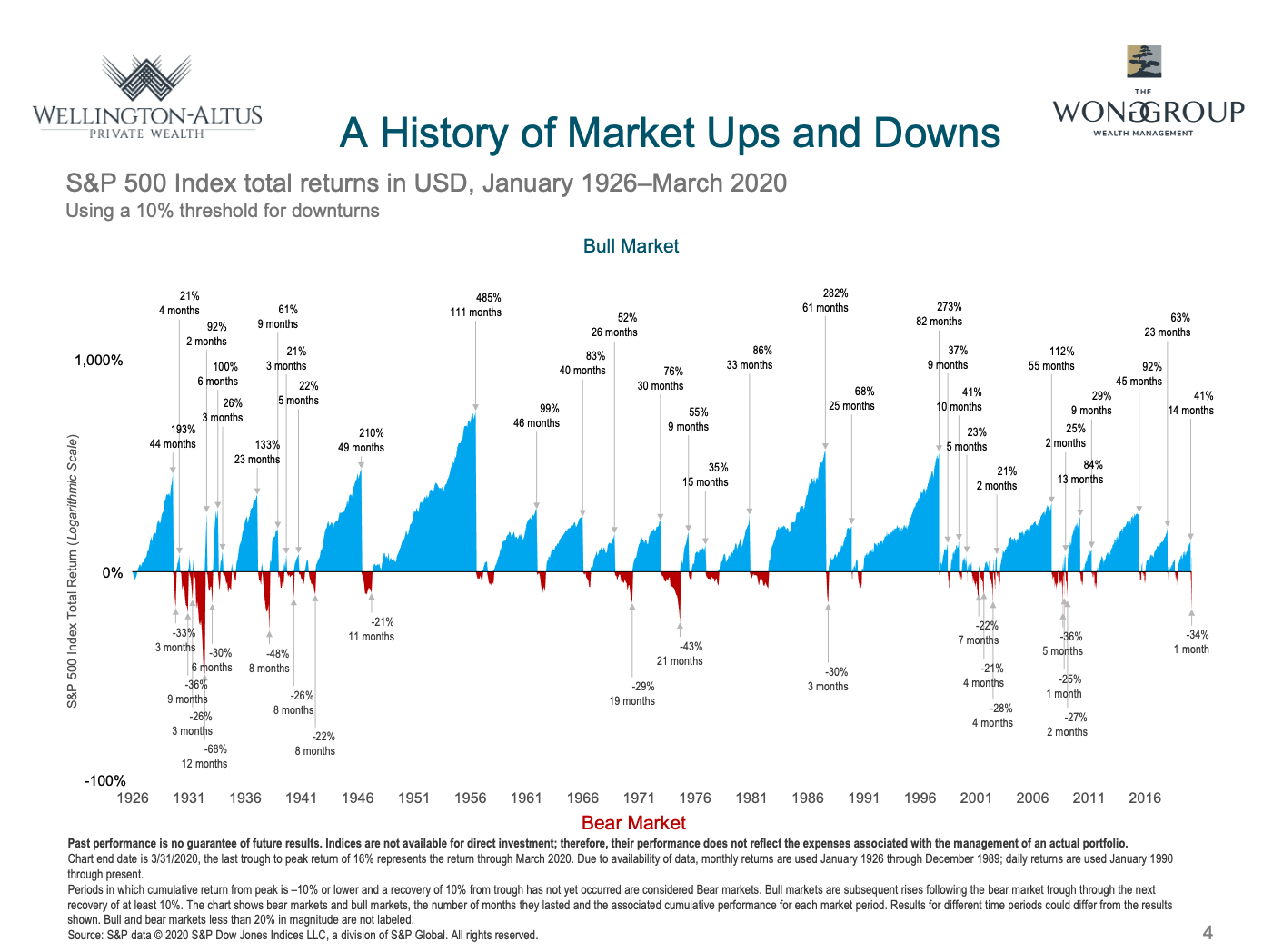
Slide 4: A History of Market Ups and Downs
Some good news as well, is that the good times typically last longer than the bad times. This chart shows a timeline from 1920 to the end of last year, with the blue being periods of the US Equity market growing, punctuated by brief red periods of market declines of 10% or more.
We can see from the chart that good times for the market have been disproportionately longer than the bad times, and the duration of the bull run is not a useful indicator of future performance. We expect positive returns every day, and while there is no consistent way to predict when realized performance will be positive or negative, investors staying the course have been rewarded over the long term.
But I get it. With all the negative news headlines bombarding us every day, many investors may become concerned during periods like now, fearing a downturn must be right around the corner. But history suggests that a surging market and new index highs do not necessarily lead to a subsequent plunge.
Check this out.
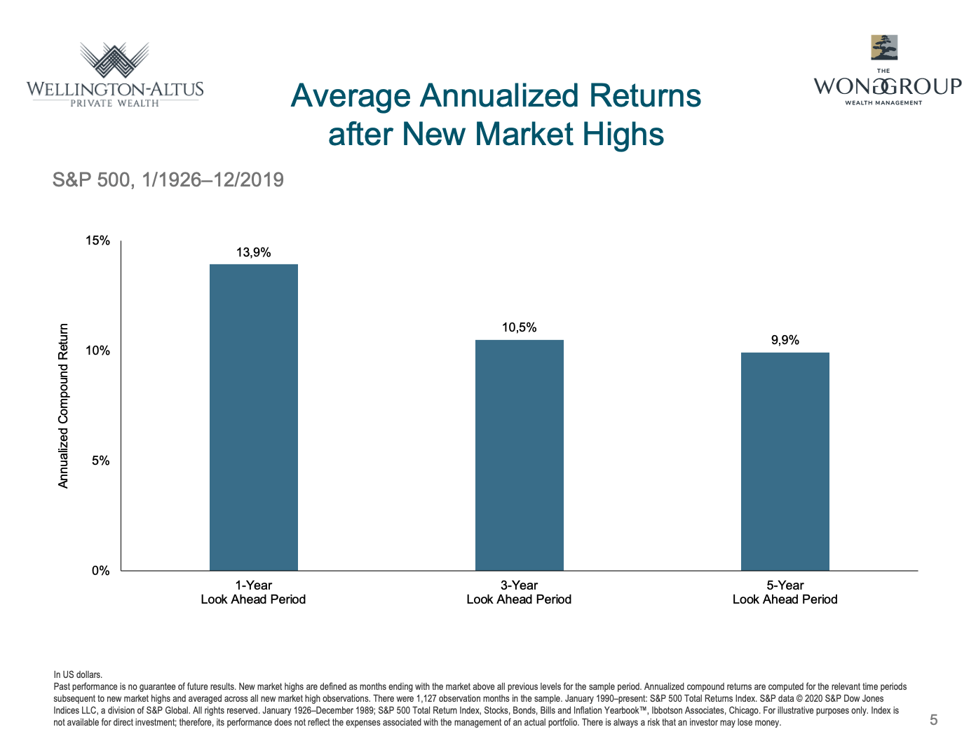
Slide 5: Average Returns after New Market Highs
This chart shows the performance of US large cap stocks after the index hit new market highs. New market highs are defined as months in which the market is above all previous and are shown for US large caps over one-, three-, and five-year annualized periods.
Guess what? Even after making new highs, the average return 1 year late is +13.9%. Three years after making new highs, the market is up 10.5% annualized return per year, and the 5 year return after making new highs is about 10% per year. This chart goes back to 1926 representing almost 100 years of data.
How does it look for Canadian equities? What do the subsequent years of returns look like after Canadian equities hit new highs?
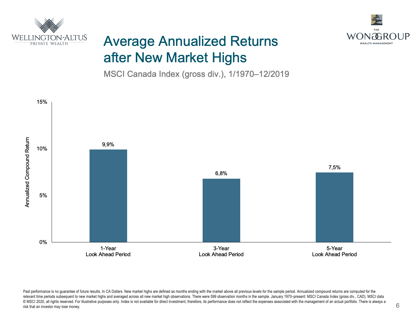
Slide 6: Average Annualized Returns after Market Highs (CAD)
Basically, it shows the same thing. After making new highs, Canadian equities have averaged an annualized return of between 6.8% and 9.9% per year, in the subsequent 1, 3 and 5 year periods.
Ok but maybe you feel very strongly that a correction, of at least 10% is just around the corner. Why not sell everything and buy back in later?
Because market timing can be very costly. Even if you get the timing exactly right on the way out, the fear and stress may just simply be replaced by the fear of missing out.
Besides, there is good news. As your Portfolio Manager, we like to use the market volatility to your advantage, and that is to buy good quality assets “on sale”. That said, is even when the markets pull back by 10% or more, they can be a great opportunity to put more money to work.
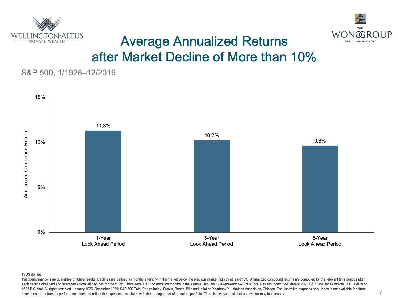
Slide 7: Average Annualized Returns after Market Decline of 10%
This chart shows the performance of the US equity markets AFTER a market decline of 10%. While some investors may sell out to avoid the risk of further losses, these pullbacks can be a great opportunity to add new cash from the sidelines, as the expected returns go up. Since 1926, when the US equity market drops by 10% or more, the subsequent annual returns after 1 year, 3 years or 5 years, have been approximately 10% per year or more. And we see a similar result when look at Canadian equities.
Equities can reward investors who maintain a long-term outlook. But over shorter periods, the market can perform inconsistently, which may test one’s commitment to a long-term strategy.

Slide 8: Picking the fastest lane is a stressful guessing game
Many people think they need to predict where prices are going to get ahead, but this is not required to outperform markets.
How many times have you been stuck in traffic and switched to a faster lane only to come to a standstill. Doing this adds anxiety and increases the risk of an accident and you may or may not have improved your situation. Picking the fastest lane is a stressful guessing game. Again, the point is that it’s more about TIME IN the markets than it is about TIMING the markets.
Now, it’s important to remember, that the performance of stock markets can be wildly different from day to day and year to year. Investors would do well to consider volatility to be normal.
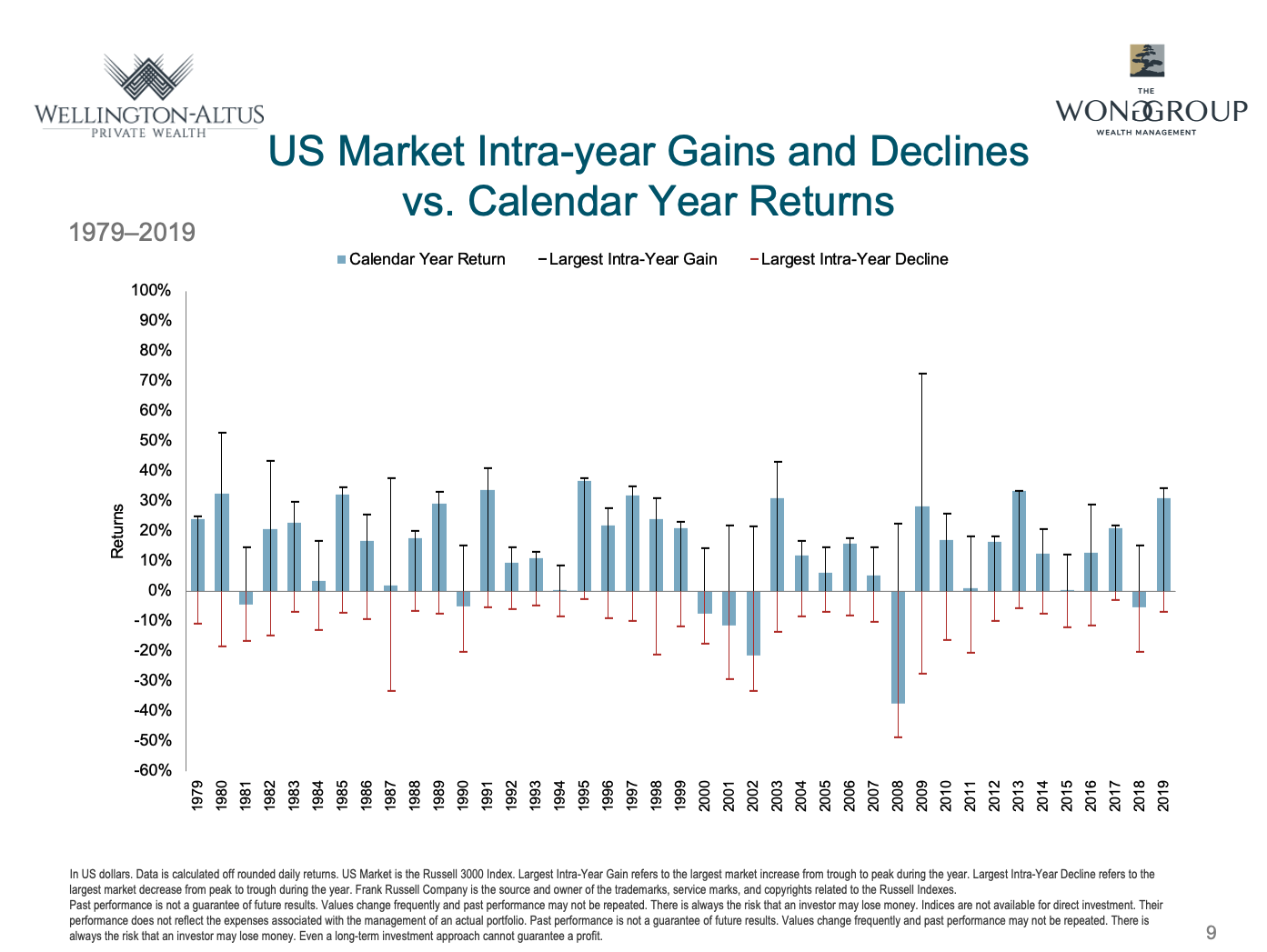
Slide 9: US Market Intra-Year Gains and Declines vs. Calendar Year Returns
I show you this chart only to illustrate one point. That is that over the past 40 years, while the US equity market ends up with a positive return, almost every year experiences at least 1 correction of at least 10% or more. The blue bars show the US equity market returns each year. The black and red whiskers show the largest gain and decline within each year.
Even in years with high calendar-year returns, a large intra-year decline may have occurred. The performance for any given time period does not need to prompt action. A long-term focus can help block out the noise.
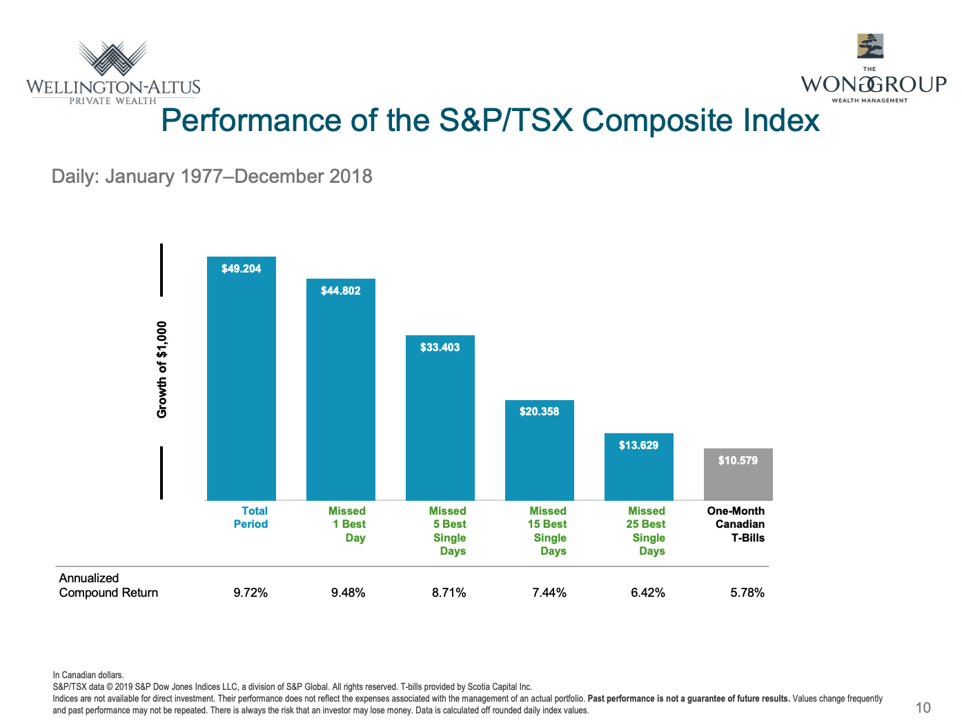
Slide 10: Reacting can Hurt Performance
I mentioned earlier the cost of trying to time the markets. This slide shows how trying to sell at the top and wait to get back in can cost you in lower long term returns. Missing out on even a few of the market’s best days each year can have a significant impact on cumulative returns.
The harsh reality of market efficiency has not stopped speculators and other traders from attempting to read the future. On paper, market timing offers a seductive prospect: By predicting market direction ahead of time, a trader might capture only the best-performing days and avoid the worst.
This slide tells the other side of that story. Large gains may come in quick, unpredictable surges. A trader who misinterprets events may leave the market at the wrong time. Missing only a small fraction of days—especially the best days—can defeat a timer’s strategy.
For example, since 1977, missing the best 25 trading days would have significantly cut the S&P TSX Composite Index’s annualized compound return, by almost a third.
Trying to forecast which days or weeks will yield good or bad returns is a guessing game that can prove costly for investors. Leave it to us to help use the volatility to your advantage and stack the odds in your favor over time.
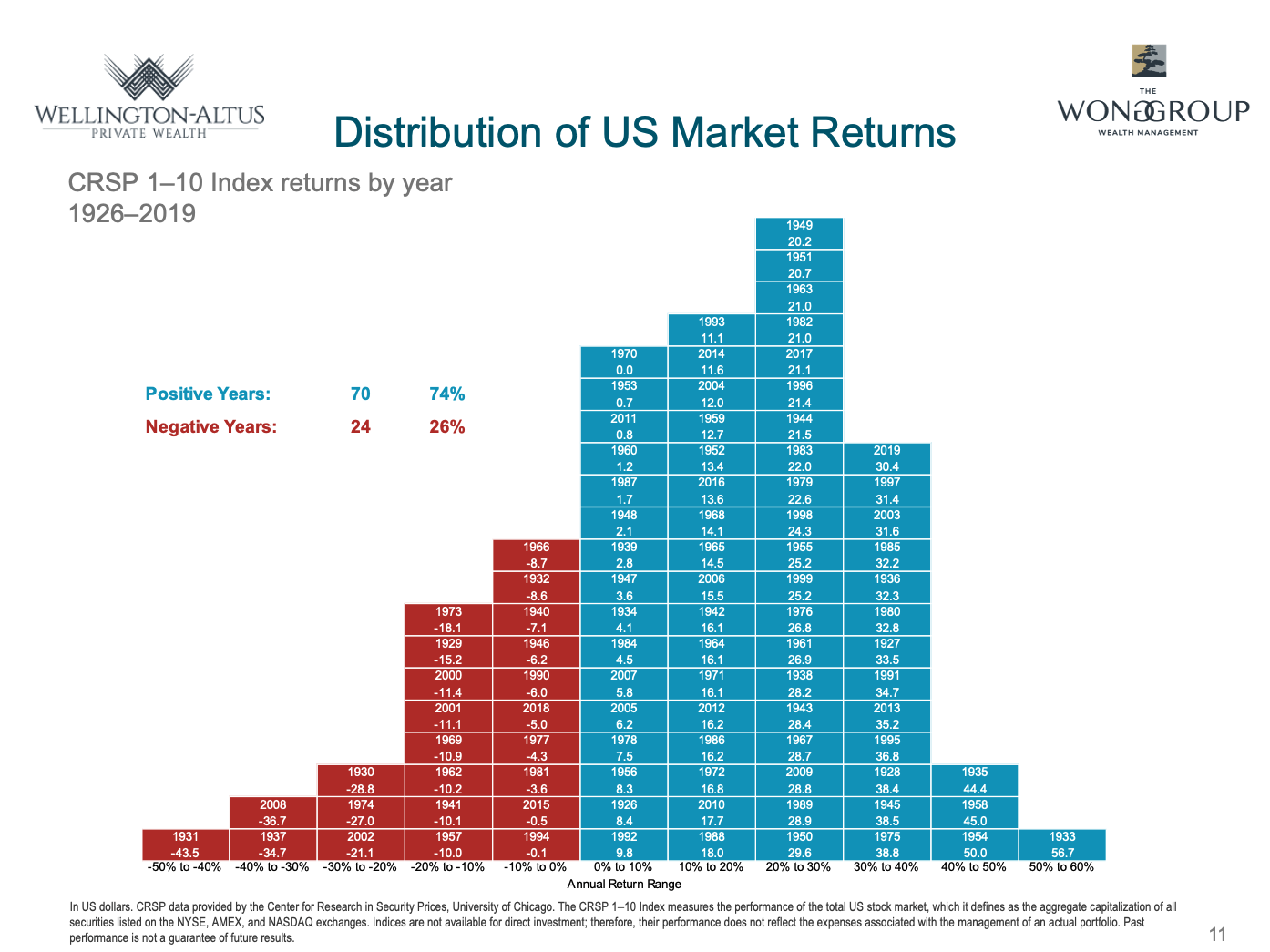
Slide 11: Distribution of US Market Returns
Yes, there can be bad years, but the good news is that there are more often good equity market years than there are bad.
The above chart shows the historical distribution of US market returns since 1926. The blue boxes are years where the US market delivered a positive return, while the red boxes are years where it delivered a negative return. 74% of the years were positive, and only 26% were negative, over the past 95 years.
History shows that the stock market has rewarded investors who can bear the risk of stocks and stay committed through various periods of performance.
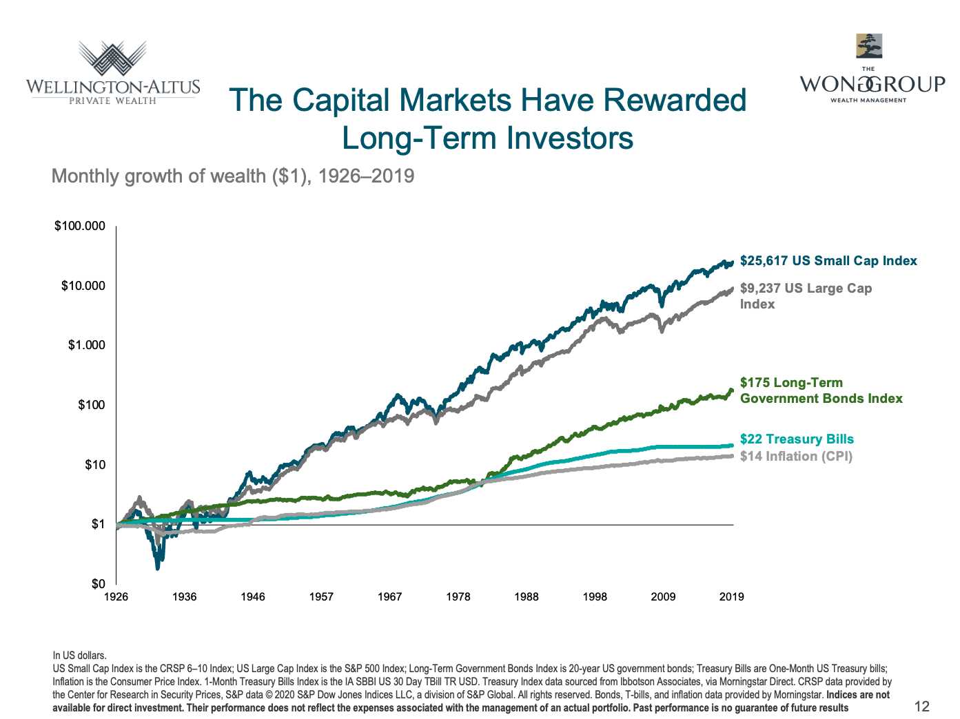
Slide 12: The Capital Markets Have Rewarded Long Term Investors
And so what’s the reward? Well, the pay-off comes in the form of higher returns for stocks over bonds and GICs or T-Bills over time.
This chart shows a long term chart of the growth of $1 USD going back for as long as we have good data, nearly 100 years. $1 USD over that time would need to be worth $14 today, just to keep up with inflation. Investing that $1 in Treasury bills or GICs averaging 3% would be worth $22 today. Investing that $1 in government bonds would be worth $175. But the better news, is that investing that $1 in US large cap stocks would be worth over $9200. And in small cap stocks it’s even more, than $25,600!
That’s the power of long term investing. Even if your time horizon is not 100 years, the point is that you can expect a higher return from stocks over bonds over time. The trade-off is that stock prices fluctuate and that volatility is an inherent part of investing.
But next time, try looking at volatility as creating opportunity, and focus on what you can control.
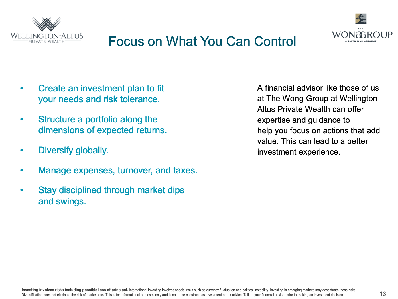
Slide 13: Focus on what you can control
At the Wong Group at Wellington-Altus Private Wealth, we utilize our expertise, care and guidance to help you focus on actions that add value, and to focus on the things you can control, in order for you to have an outstanding client investment experience.
It starts with working with an experienced advisor to create a financial and an investment plan based on market principles, informed by financial science, and tailored to a client’s specific needs and goals. Along the way, we can help you focus on actions that add investment value, such as managing expenses and portfolio turnover while maintaining broad diversification.
Equally important, we can provide knowledge and encouragement to help you stay disciplined through various market conditions.
As always, my team and I are here to help you and your loved ones have a positive client experience while achieving your financial dreams and goals.
If you’d like to schedule an appointment with me or one of my associates, please contact us at 778 655 2410 or use the chat feature or contact form in the footer below.
I look forward to connecting with you again soon.
Happy investing and may the Smart Risks ever be in your favor.
Sincerely,
Maili Wong, CFA, CFP, FEA
Senior Portfolio Manager
Executive Vice-President
If you have any questions about how this relates to you or your investment portfolio and financial plan, please give us a call at 778 655 2410 or email us at thewonggroup@wprivate.ca